Wednesday, 28 October 2015

Context of Practice 1 - Lecture 3 - Chronologies 1: Type - Production + Distribution

Mesopotamia - 3200 BCE- origin of type

First true alphabet = Greek alphabet (pictures of sounds). Latin was the development of Greek Alphabet. 

1450 - Johannes Gutenberg - invented printing press- first thing he printed was the Bible

1870 - William Foster - influence on need for type - introduced the Education Act of 1870 - making education compulsory - so more learnt how to read and write - used to be just for higher classes. Need for mass produced literature.

1919 - Walter Gropius - looked at difference between design of letter and function of letter

1957 - Max Miedinger - created Helvetica - neutral font - birth of modern typefaces. Born out of Bauhaus. Clear, concise, versatile font.

1982 - Ariel - developed by Microsoft - released 25 years after Helvetica - both similar to each other.

1990 - Steve Jobs - Apple Macintosh - less than $1,000 - more affordable to people. Brought in the ‘mouse’ - can design type digitally.

1994 - Vincent Connare - designer of Comic Sans MS. He worked for Microsoft. 

Monday, 26 October 2015

Surrealism in Advertising - Analysis - OUCA401

This advert has notions of surrealism as it relates to RenĂ© Magritte. Magritte’s work often portrayed a blue sky and white clouds, which is featured in both the canvas painting and the background. Having the sky feature both in the painting and the canvas, as if the painting is simultaneously on the canvas and in the background, manipulates our perceptions, and also refers to one of Magrittes own paintings, ‘The Fair Captive’. Moreover, it features Magritte’s ‘The Son of Man’, as a service station attendant, with his head being replaced with an hour glass (instead of the original apple) - this refers to the Magritte’s common theme of displacement.  A game of chess also features, with the trees (environment) beating the oil industry. Moreover, it shows a bottled oil tanker, which suggest that due to the car having a low consumption, it will pollute less.

This surrealist advert is showing that the new Polo BlueMotion runs on very little gas, which is good for the environment), and therefore the service station attendant is waiting a long time to refill the tank, as shown with the hourglass, and the spider coming out of the nozzle. 


Magritte’s use of juxtaposition is very strong here, with unusual objects being put together, which would be unexpected in conventional art/ adverts. This use of surrealism makes people think about the advert - what message is it trying to convey? Thus, this surrealist advert is memorable and a discussion point. The copy, ‘absurdly low consumption’, also refers to surrealism. Upon looking at the advert, the juxtapositions make it different, disruptive and irrational. 


Another of Polo’s adverts refers to surrealism, specifically the work of surrealist artist Salvador Dali, who played on optical illusions and being in a dream-like state.  This advert relates to his famous melting clocks artwork (The Persistence of Memory). It highlights that due to the cars low oil consumption, the oil industry will be harmed, as shown with the melting oil meter. This advert also has connotations of Magritte, with the white cloud in the shape of an oil can, which appears to be fading away.

Both of these adverts have been influenced by Surrealism, and therefore have also been influenced and affected by the work of psychoanalyst Sigmund Freud. Freud wrote about dreams, hallucinations and the subconscious in his book, ‘Interpretation of Dreams’. 


References

'The problem of meaning' - Workshop 4
www.surrealists.co.uk
Google Images


Thursday, 22 October 2015

An Advert with mythological connotations - OUCA401

Skittles Advert - Midas Touch


This advert features a man who turns everything he touches into Skittles, including humans. This advert is humorous and clever, however also links with the Greek myth surrounding King Midas. King Midas had the ability to turn everything he touched into gold, a relation to the man turning everything into skittles. The advert and the myth share another similarity, with the subject of children. In the advert, the man complains about not being able to hold his newborn child, and in the myth, Midas mistakenly hugs his daughter, and consequently she turns into gold.


Friday, 16 October 2015

Evaluation of Mary Wells - OUCA401

Mary Wells had a revolutionary part in Advertising; being the founding president of Wells Rich Greene and being the first female CEO of a company listed on the New York Stock Exchange.

Wells began as a copywriter of McKelvey’s Department Store, and then moved on to working in the advertising department at Macy’s. In 1957, she joined Doyle Dane Bernbach, where she created her first famous advertising image. 

Wells shined when she worked for Jack Tinker & Partners, creating famous campaigns such as ‘Plop, plop, fizz fizz’ for Alka-Seltzer. The company had been unpopular as people tended to associate its products with overeating, but Wells completely changed that. 

Some of her most famous work was for Braniff Airways. When Wells was a child she took theatre lessons, and it was with Braniff Airways that she first incorporated her theatre knowledge into advertising. She ended the ‘plain plane’. She made the planes and uniforms colourful and created the ‘The Air Strip’ which drew customers in, especially from the baby boomer generation.

In 1967 she, and two of her associates, opened up their own company, of which she was the president of. It was called Wells Rich Greene. Her experience in theatre helped bring a dramatic flair to her commercials. By using her drama knowledge in her work, it set her company apart from all the others as they related better to their clients. 

“Mary really influenced how promotion and product changes were part of the role of an advertising agency.” - Charlie Moss

“Of course, I’m a legend. But it’s not because of any great gift I have. It’s because I’m a risk taker.” - Mary Wells, 2002 


Resources

https://www.youtube.com/watch?v=H3_aNtQFsLk 

'Art and Copy' - documentary - 2009 - directed by Doug Pray

http://www.adweek.com/sa-article/lifetime-achievement-mary-wells-131861

http://adage.com/article/adage-encyclopedia/history-1960s/98702/

http://adage.com/article/special-report-the-advertising-century/mary-wells-lawrence/140198/

http://facstaff.elon.edu/gibson/COM322/Written/ResearchPaperFiles/MaryWellsLawrence.pdf 


Wednesday, 14 October 2015

Context of Practice 1 - Lecture 2 - A 20,000 year non-linear history of the image


  • There is a belief that visual communication started in the Lascaux caves (France). There are drawings on the cave walls which show signs of them attempting to communicate with their Gods/Spirits. Some of the drawings are merely markings, although one philosopher has suggested they represent hallucination dots.
  • 21st Century, Twombly - there are markings on giant paintings (similar to the ones in the Lascaux caves). 
  • 'Magicians of the Earth' is an exhibition which attempts to make links between ancient and modern art. It accuses the West of cultural appropriation. 
  • Mona Lisa by Leonardo de Vinci - reproduced onto material objects - available to the masses - not just one gallery which therefore has restricted viewing. Marcel Duchamp reproduced Mona Lisa but with a beard and moustache - he named it L.H.O.O.Q.  In 2013 Banksy portrayed Mona Lisa as an Islamic extremist ( Mona Lisa Mujahideen), through graffiti street art which is available for all. 
  • Following the revolution, Russia was the cultural leader of the world. But when Stalin got into power, he banned progressive art work, claiming it was not understandable for the common man - instead art became simple like 'Roses for Stalin' (1994- Vladimirski). The USA saw this as suppressing people and so therefore they encouraged abstract artists like Jackson Pollock.
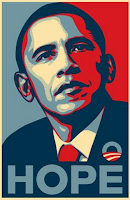
  • Shephard Fairey, in 2008, created a famous Obama poster supporting his campaign. But in 2011 he manipulated his own work to show America/Obama negatively. It became a symbol of faceless anarchy - an iconic image of solidarity in protest.
  • Pictures have the ability to change history - the photos of the Atomic Bomb aftermath made America pull out of the Vietnam War.


Tuesday, 13 October 2015

Context of Practice 1 - Lecture - Visual Literacy - The Language of Design


Visual Communication

-affected by audience, message, media, context
-process of sending and receiving messages using type and images
-based on a level of shared understanding of signs, symbols, gestures and objects

-made up of presentational symbols whose meaning results from their existence in particular contexts 
-requires an awareness of the relationship between visual syntax and visual semantics 

Visual Literacy

-ability to construct meaning from visual images and type
-interpreting images of the present, past and a range of cultures
-producing images that effectively communicate a message to an audience
-ability to interpret, negotiate and make meaning from information presented in the form of an image 
-all that is necessary for any language to exist is an agreement amongst a group of people that one thing will stand for another e.g. horizontal and vertical line could mean plus, positive etc
-colours influence interpretation - plus sign coloured red = Red Cross, green = medicine. Size influences e.g. vertical line longer = Christianity. Cross on flags manipulated to interpret image differently - England, Switzerland.

Visual Syntax

-The syntax of an image refers to the pictorial structure + visual organisation of elements. It represents the basic building blocks of an image that affect the way we ‘read’ it.

Visual Semantics

-The semantics of an image refers to the way an image fits into a cultural process of communication. It includes the relationship between form and meaning and the way meaning is created.

Semiotics

-Study of signs + sign processes (semiosis), induction, symbolism, metaphor. Closely related to linguistics (structure/ study of language) as well as non-lingustic sign systems.

Visual Synecdoche 

-When a part is used to represent the whole, or vice versa. e.g. statue of liberty = New York.

Visual Metonym

-Symbolic image that is used to make reference to something with a more literal meaning.

Visual Metaphor


-Used to transfer the meaning from one image to another.

Lever Brothers and Sunlight Soap - OUCA401


          'Honesty in advertising… is a cardinal principle'  - Lever 

Context 

Sunlight reflected the Victorian attitude that women should be ‘Angels in the House’, as cleanliness was essential for happy marriages. However, perhaps it encouraged feminine power as women were the consumers.

Sanitary improvements popularised Sunlight, e.g. the provision of water. Moreover, the belief that ‘less civilised’ people e.g. Africans, needed to be ‘cleansed’ in order to fit with British cultural superiority, fuelled the industry. 


Art and Copy 

Strategies included the notion that Sunlight would reduce the burden of housework, helping women’s relationships to flourish. Patriotism, e.g. showing the Royal Family, appealed to domestic/ imperial markets. WW1 was used favourably; advertisers encouraged women to send soap to the soldiers. 

Furthermore, the fear of contacting diseases and social faux pas encouraged purchases. False medical statistics stimulated the sale of Lifebuoy soap as a precaution. Lever claimed Lifebuoy would protect one from ‘BO’, a social disgrace which would prevent marriage and economic stability. 


Resources

'So Clean' Lord Leverhulme, Soap and Civilization - Brian Lewis


Sunday, 11 October 2015

Marks in Time Exhibition - OUCA401

History

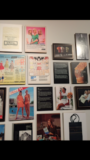
M&S began in Kirkgate Market, in 1884. Goods were sold for a penny, affordable for the working class.  In 1920, M&S was re-marketed to appeal to the middle class. Goods increased in price and quality.  Due to WW2, there were limitations in materials, and therefore clothing was designed as durable, simple but nevertheless eye-catching. The 1950s brought the luxurious ‘new look’ dress, together with television adverts. 

To appeal to 1960s youth, dresses had shorter hemlines, and tights replaced stockings.
Traditional values in the 1970s were declining, and so M&S introduced ‘boil in bag’ meals. Women’s clothing was expanded into work wear, e.g. pencil skirts. 
Now, M&S has clothing ranges such as Autograph, and has an environmental Plan A scheme.


Values

The original core brand values were quality, value, service, trust and innovation. Now, they are inspiration, integrity, in touch and innovation. However, the originals are still incorporated:

  • Quality - Since 1926, they have bought directly from manufacturers. 
  • Value - Although not a penny anymore, goods are sold at affordable prices.
  • Innovation - In 1980 they sold the first Iceberg lettuce, and now have brought out Cook Asian 1234.
  • Service - In 1935 the M&S Cafe was opened, and since 1999 M&S has been accessible through the internet. 
  • Trust -  In 1975, they reduced energy consumption by £500,000, and Plan A expands on this.


Integrity -  It supports relationships between fathers and their children. M&S shows integrity by using a real father and son pair. 

Inspiration - Stereotypically, males enjoy football and therefore a poster featuring Jamie Redknapp is appealing. It presents shopping at M&S exciting. The language supports this, e.g. ’number one fan’ and ‘top of the league’. 

Innovation - Men/children are the target audience, instead of women who are generally seen as the shoppers. The grey-blue background steers away from conventional feminine colours. 

In Touch - It suits its context and is heartwarming/emotive. It highlights the variety of goods they sell. 


Resources


M&S company archive visit - 5th October 2015
Fit for the future - estudio presentation - 2014 http://corporate.marksandspencer.com/investors/cd8f43cf10e242e48560fc59a0531073
http://annualreport2010.marksandspencer.com/downloads/13620_M&S_Review10.pdf


Thursday, 1 October 2015

An advert and its social/political context analysis - OUCA401


This 1976 advert was used to attract African American customers, especially due to the language used. For example, ‘dinnertimin’ was a popular phrase, especially as it ‘dropped the g’. This distinguishes it from a campaign aimed at white Americans, who wouldn't have used that style of speaking. The absence of racial slurs, as well as using vocabulary such as ‘easy’ and ‘relax’, suggests that African Americans don’t need to be frightened of receiving racial abuse if they go to McDonalds. 

With the 1964 Civil Rights Act being passed only twelve years prior, it is likely that McDonalds would have only been newly de-segregated, especially in the South. African Americans would have previously used the ‘Negro Motorist Green Book’, to plan where they could eat, and therefore by using language such as ‘different place’, it emphasises that McDonalds is one of the new restaurants they can now safely eat in, instead of their formerly limited options. 

The image also reflects the context of the 1970s. The American Association of Advertising Agencies estimated that Americans would have seen 1,600 adverts daily, but only 12 received a reaction. Therefore, having only black people present would have captivated all viewers.

The poster mentions that one does not ‘have to get dressed up’, which is also reiterated in the visuals; the family is dressed very causally, e.g. T-shirts. This would have appealed to African Americans as they were generally paid less than white people, and may not have been able to afford to eat in luxury  restaurants. Moreover, the picture of a family eating together would have been alluring as due to discrimination in the work force, African Americans would have been working long hours. It stresses that McDonalds will give families an opportunity to spend time together. 

Lastly, it is vital to note that African Americans were the largest minority group. In 1970, there were 11.1% black people, but only 0.4% American Indians. McDonalds aimed this campaign at African Americans as they had a considerably larger spending power than other races. However, it can be argued that it wouldn’t appeal to them as the language was influenced by their stereotype. Charlton Mcllwain, a NYU professor, has stated that it was “the outcome of [advertisers] trying to do the right thing, but not necessarily knowing what that meant.”


Resources 

references:
http://www.theatlantic.com/entertainment/archive/2015/06/casual-racism-and-greater-diversity-in-70s-advertising/394958/